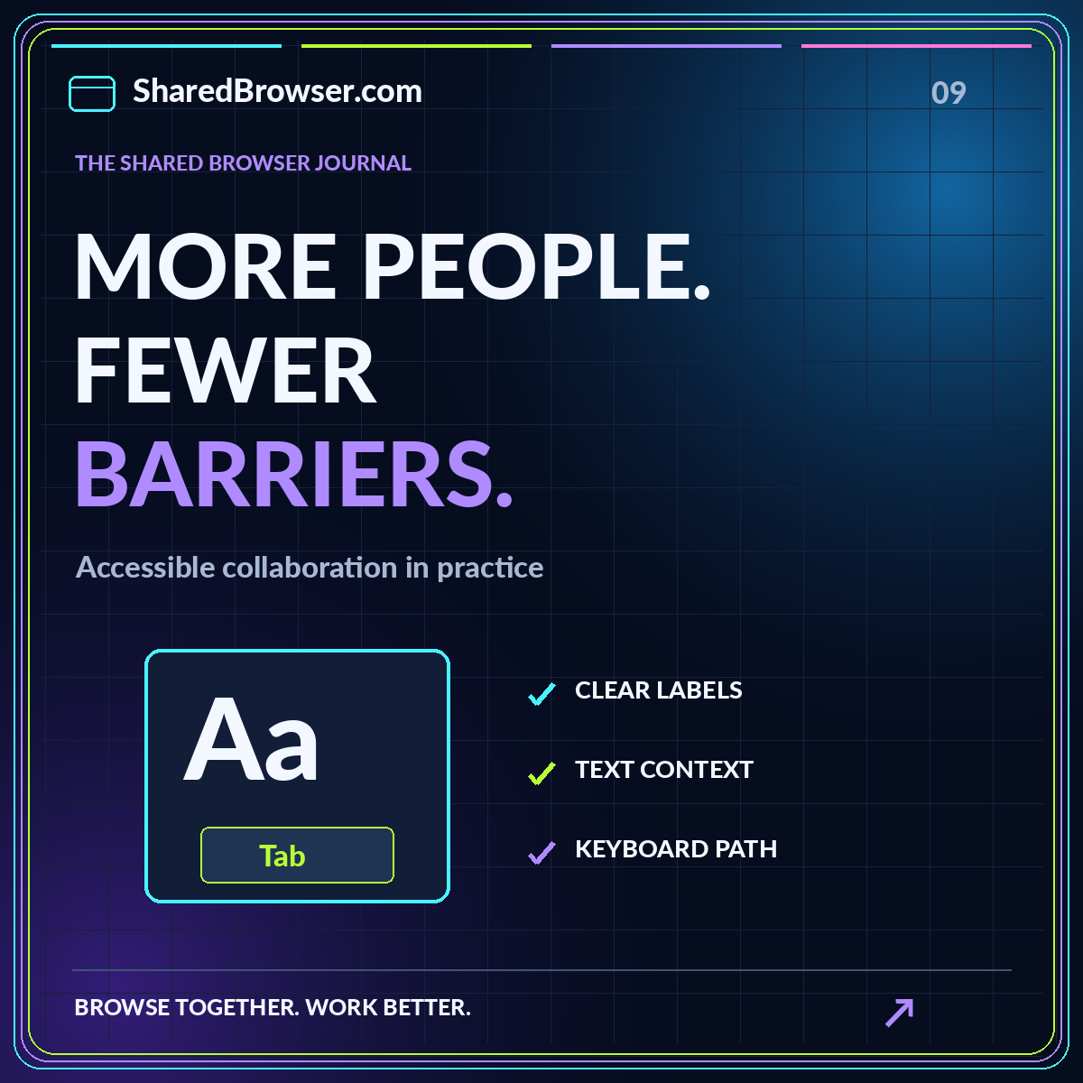
A shared workspace is only useful when the intended participants can understand it and take part. A tidy visual board may still be difficult to navigate with a keyboard, confusing when read aloud, or dependent on a fast-moving conversation that some members cannot follow. Accessibility belongs in the structure of the work as well as in the interface of the tool.
This guide focuses on practical choices a team can make when organizing browser-based research, collections, and handoffs. It is not a claim that a particular workspace meets an accessibility standard. Use it to improve the content you control, evaluate the tools you use, and identify issues that need testing with the people who will actually participate.
Start with a readable project map
Give the workspace a clear title and a short purpose statement. Put the current question, important references, decisions, and next actions in predictable places. A participant should not need to remember a meeting or inspect a decorative diagram to work out what the project is about. Explain unfamiliar abbreviations the first time they appear.
Use headings that describe the information beneath them. “Open questions” and “Decision record” are more useful than “Other stuff” and “Latest.” Keep the structure shallow enough to scan without flattening everything into one long page. Our shared workspaces overview offers a simple information model that can be adapted to an approved document or collaboration tool.
Make link text carry its meaning
A page containing repeated links labeled “here” forces readers to recover meaning from surrounding context. Write links that identify the destination or task, such as “Review the source-quality checklist.” Include relevant format information for downloads when it helps the reader decide whether to open them. Avoid displaying a long raw address when a clear description is available.
The W3C Web Accessibility Initiative's writing guidance recommends meaningful links, informative titles, structured headings, useful text alternatives, and clear instructions. These are content practices, not a complete accessibility audit. Apply them to source notes and project handoffs as well as to public web pages, then check how the chosen tool presents that content to users.
Do not make color the only instruction
Color can make a collection easier to scan, but pair it with text. A green card should also say “Reviewed” when that is its meaning. A purple collection should have a readable name rather than being described only as “the purple one.” This helps people who perceive color differently and people working in a context where the colors are not readily visible.
Use emoji and icons as supporting cues rather than replacements for labels. A folder symbol may decorate “Reference library,” but the text should still explain the destination. Avoid long strings of decorative symbols inside important instructions. When writing a handoff, name the item directly so the recipient can find it through text search, a screen reader, or the tool's navigation structure.
Check the actual keyboard path
Test ordinary tasks without relying on a mouse: opening the workspace, moving through navigation, following a reference, expanding a disclosure, and returning to the main content. Watch for a visible focus indicator and a logical order. Check whether a menu can be opened and closed and whether focus remains understandable afterward. Record the specific task that fails rather than writing only “keyboard support is bad.”
A short test cannot prove that a tool is accessible in every situation, but it can reveal blocking issues in your workflow. Include the browser and environment used in the observation. Share the result with the tool owner or support team, and provide an alternative route to the affected material while the issue is being addressed. Do not require a participant to work around a known barrier alone.
Keep the content usable when the view changes
Open the workspace in a narrow window and at increased text size. Look for clipped labels, hidden actions, horizontal layouts that lose meaning, and fixed headers that cover the item you just followed. A layout that fits a large monitor may not work well on a small display or with magnification. Essential information should not depend on seeing several columns at once.
Prefer concise card summaries linked to readable detail pages over cramming every sentence into a tiny tile. When a comparison genuinely needs a table, use clear headings and an explanation of what is being compared. Offer a linear summary of the key tradeoffs where helpful. The purpose is to preserve relationships in the information, not simply shrink the same desktop arrangement until it technically fits.
Provide text context for visual material
A screenshot can show an interface, but it may not explain the problem or the action required. Add a short description of the relevant control, its label, and the intended step. If an image is only decoration, do not make it carry information that appears nowhere else. Keep meaningful instructions in selectable text rather than only inside a social-style graphic.
For a chart or complex diagram, describe the point the reader should take from it and provide the underlying information in an appropriate form. Avoid treating automatically generated image descriptions as a substitute for checking accuracy. The person who understands the project should confirm that the alternative conveys the relevant meaning. A beautiful preview should supplement the project record, not become the only way to understand it.
Make asynchronous participation a real option
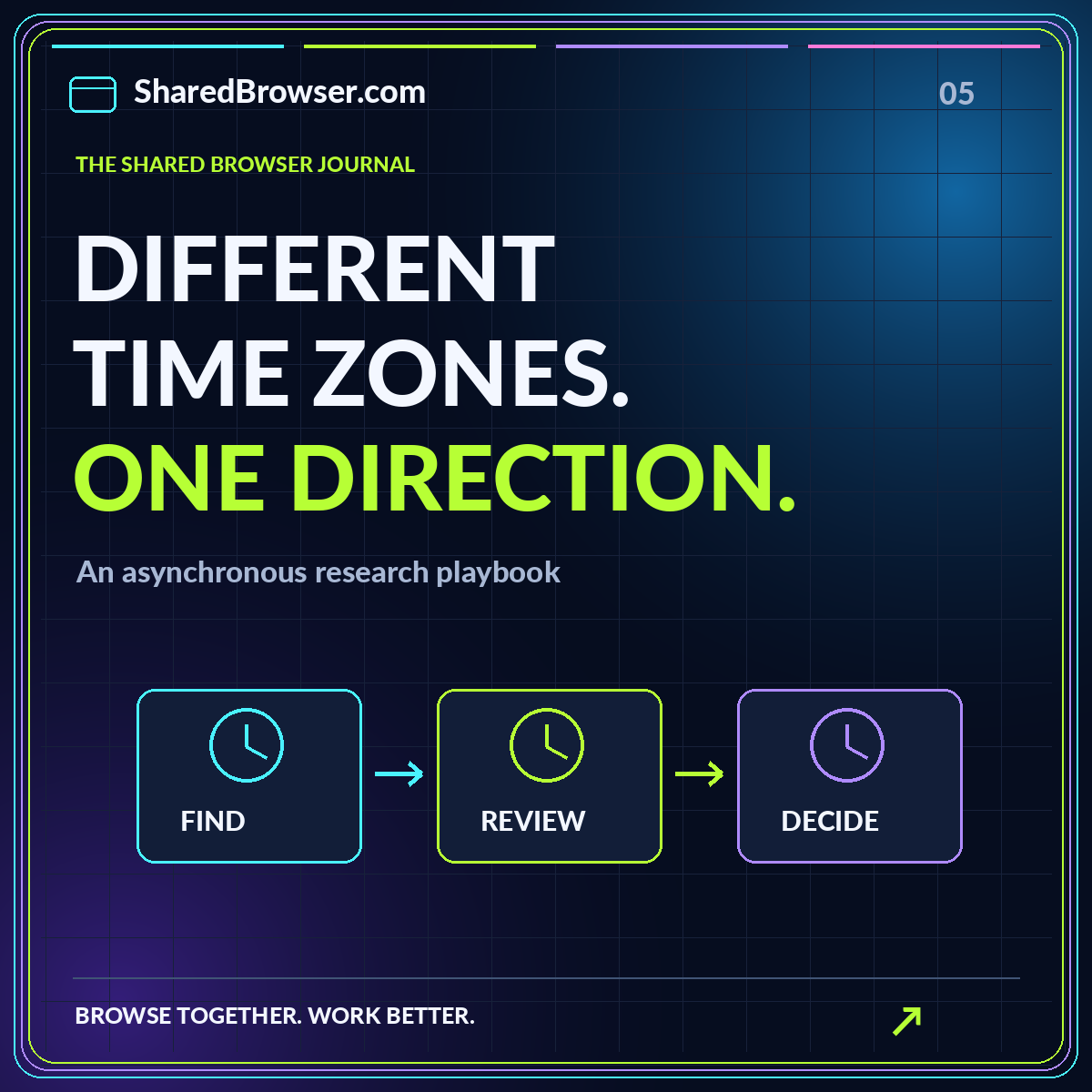
Share the question and reference material before a live review. Give participants a way to contribute written observations and identify a response window. This allows people to read at their own pace and formulate questions without competing for attention in a rapid conversation. Do not equate absence from a live session with absence from the work.
After the session, publish the decisions and remaining questions in the same shared record. A long recording alone can make it difficult to find a specific outcome. Include a concise written summary and appropriate captions or transcripts for media used in the workflow. Our asynchronous research guide shows how clear briefs and handoffs can carry context between people who are not online together.
Narrate shared browsing deliberately
During a live demonstration, name the page and the control you are discussing. Replace “look at this” with a description of what changed and why it matters. Pause at important steps and check whether participants can follow. Let people request a slower pace or another explanation without needing to disclose personal information about why that support is useful.
Keep a text version of the task nearby. When the presenter scrolls quickly or switches windows, the written outline can help participants maintain context. Explain who is controlling the session and how someone can ask to stop or return to an earlier step. Accessibility and consent often meet in the same practical habit: making the current state of the interaction understandable.
Review the workflow with participants
Ask people to complete realistic tasks using the workspace rather than only commenting on its appearance. Can they find the current decision? Can they identify which reference supports it? Can they contribute a note and understand what happens next? Invite feedback through more than one channel and avoid making one participant responsible for representing everyone with similar access needs.
Prioritize barriers that prevent participation, then address confusing structure and unnecessary friction. Record the issue, the affected task, the responsible owner, and the available alternative. Recheck after changes. A team should not describe a workspace as universally accessible merely because a basic automated check passed or because it includes a few accessible-looking components.
Build inclusion into the routine
Accessible collaboration is easier to maintain when clear labels, structured notes, text summaries, and alternative participation routes are normal parts of the workflow. Add those expectations to the project brief and review checklist. Keep the process practical so contributors can follow it during busy work, not only during a special cleanup exercise.
Start by improving one real handoff. Give it a clear question, meaningful links, a readable structure, and an explicit next action. Test it in the actual tool with the relevant participants. A shared workspace becomes more inclusive when understanding does not depend on one device, one visual arrangement, or one moment in a live conversation. The resource library includes text-based templates to support that approach.